What is this and why is it here? crossgeared.com was and now is again my blog. A blog is like whatever social media platform exists in your bubble, but is more difficult to maintain, is harder to find, and takes longer to read (no character limits). The crossgeared.com blog began in 2006, I stopped posting in 2013 and forgot about it for a decade or so, and it’s now 2026 and I’m back. Having been away for so long, I had to reacquaint myself with my blog, and this one appears to be mostly cycling related with a few old cars and tech related topics thrown in. I added a tag cloud way down there at the bottom (just above my AI statement) that summarises all of this content for anyone interested.
Update (August 2026): the tag cloud has become oollyClouds, the animated word cloud WordPress plugin. Cycling has remained a one of my favourite topics, I’ve added the decarbonisation of both transport and home energy and have more to say on these last three topics.
Where do I not use AI?I wrote the words you’re reading on this site (aside from possible spelling and grammar checks), but I’ve been usingObsidian,BBEdit, and the WordPress editor, which are all pretty basic from this perspective. Try to find an AI that would generate that awkward sentence. 😜
Where do I use AI? I useClaudeto aid insearches, planning, research, and analysis. I also use Claude Code for some aspects of this WordPress theme, extensively in the WordPress plugins I’ve been developing, and for some of the other data visualisations you see here. Any changes will be posted here.
My statement (also posted in the footer below) represents what I do and do not do, and I think it speaks pretty clearly for itself. However, I’d like to talk more about the “why” behind my statement and give a little more insight into my thinking and give a few related resources I’ve found useful.
What is my philosophy of AI use?
There are many concise and pithy quotes around that convey a wide spectrum of positions on Generative AI out there, and mine isn’t going to be one of them. My thoughts on “ethical use” below are going to focus on the demand side of the issue. But, I will briefly say that on the supply side I believe that sensible and evidence-based regulation is a prerequisite, and that these supply-side issues are distinct from and likely quite a bit more consequential than my relatively narrow “ethical use” perspective below.
Back to the demand side. I believe Generative AI, including chatbots (e.g. NotebookLM/Gemini Notebook) and agents (e.g. Claude Code) can be used ethically, but one must do so mindfully and with the discipline to use these tools to enable and extend one’s own thought, and not as a replacement of the process.
What does this mean in practice?
Write your own words, think critically, and use AI tools to improve, extend, and expedite your processes: use these tools to do more, not think less.
(That’s my attempt at pithy and concise, and it contains a colon and is followed by an explanatory parenthesis.)
An example of AI use to enable and extend rather than replace?
Google’s NotebookLM/Gemini Notebook can be used to house collections of documents that can then be analysed and investigated using plain-language queries. This allows faster, broader search, analysis, and organisation of large libraries of documents. In practice, this could be as simple as asking questions of a library of product manuals and documentation (e.g. What methods are available to change the charging schedule and behaviour of my battery via the solar inverter interface?) to investigating common themes across disparate fields of research and/or sources (e.g. Provide a list of instances of the discussion of, references to, or examples of time of use (ToU) energy pricing in these academic publications, white papers, policy statements, and news items; provide citations.). Tip: read those citations and verify any claims.
I believe these examples enable working with large amounts of data (i.e. scale) with relatively low barriers to entry/learning curve (e.g. plain language queries) that can extend one’s ability to analyse these data and move more quickly (i.e. expedite) to interpretation, understanding (critical thinking) and perhaps even action. That’s doing more, not thinking less.
Where do I find challenges and contradictions in my own philosophy and use?
Claude Code and agentic (or the more judgemental vibe) coding. Is using an AI agent to develop a WordPress plugin ethical (when viewed from my premise of extend and enable rather than replace)? This is a tough one, and I think it depends on your perspective on software development.
In the beginning there was machine code (at least for my purposes) where we can write instructions (almost) directly to the machine. We can take a step and use a semantically awkward language (e.g. C); it’s easier to write and understand, but we still need a pretty deep understanding of what our code is doing (remember: 1. free(), and 2. your arrays start at 0, not 1 (yes, I checked with Claude to confirm/correct my recollection of memory management in C)). There are more steps along this path from machine code to environments with more and more understandable statements (e.g. the garbage-collecting Java), and the process continued (insert example of your favourite development environment and amazing capability here).
What’s next down this path? I don’t think it’s necessarily unreasonable to say it’s plain readable (but still precise and structured) language, and from that perspective Claude Code is one hell of a compiler (only if you don’t mind that your compiler is probabilistic rather than deterministic (another double-nested parentheses: Isn’t that called a software developer?)).
If agentic coding is a step down this path, maybe we’re at a point where “software development” and the corresponding “software developer” are no longer accurate (or at least precise) and we need to reframe what we’re actually doing here. Perhaps we need to move down the path alongside our coding agents and along to the vaunted middle management or director roles? If we do all this, maybe we’ve worked out our ethical agita (no, I didn’t use an AI to come up with this word, I took it from Kai Ryssdal) via semantics? 🤔
All that said, I’m not completely convinced here, and I think this is one of the absolutely important and deeply interesting aspects of AI use that we should engage with and think critically about (and maybe use it to restructure our sentences so they don’t end in prepositions).
References and resources
Below are a few related resources and podcasts that provide new information and interpretations that I’ve found beneficial for continually thinking through and evaluating my own position and actively deciding how I intend to use these tools now and in the future.
Center for Humane Technology, Your Undivided Attention (humanetech.com) provides thoughtful and constructive perspectives on technology (including AI) and society.
Mystery AI Hype Theater 3000 (dair-institute.org) is an overly cynical and often sarcastic critique of AI that is insightful, valuable, and identifies some of the major issues AI presents.
Intelligent Machines, formerly This Week in Google (twit.tv) gives current AI news and often provides (likely unintentionally) cautionary tales of what might happen if you go too far.
I have more to say about dropbar MTBs, but I’m going to keep this one brief.
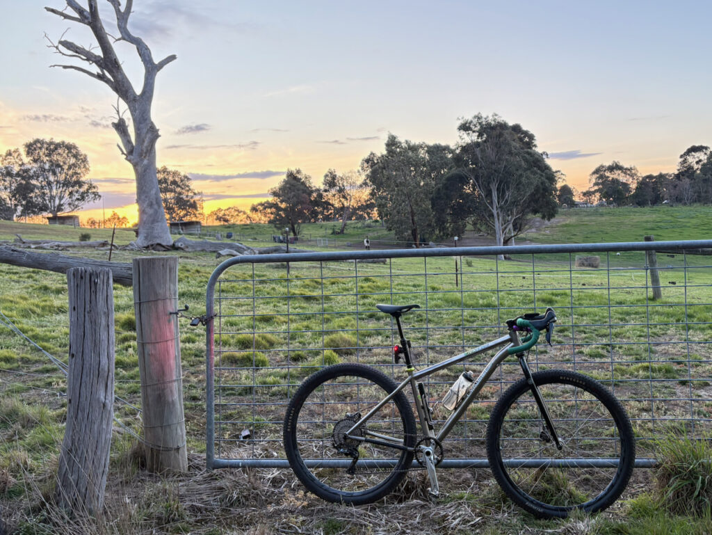
In the last post I wrote (at length) about my Kent Eriksen 650b dropbar MTB, and this time I’m going to tell you about my other (also titanium) dropbar MTB, Junebug, a 29er dropbar MTB built on a 2011 Lynskey Ridgeline 29er hardtail frame. I’m not going to go into Junebug’s full history (or provide an animated GIF baby album) but I will tell you about the important parts.
The important parts
Junebug originally belonged to my brother, Eric. Eric had appendiceal cancer and he wrote about his experience including all of the bikes (and trikes) he rode throughout this period on dropcancer.org. Eric passed away earlier this year, but he kept riding (trikes) up until the last weeks. If you read about this experience and his thoughts (I suggest this one) you’ll see that he had a similar appreciation for bicycles; all of them, not just dropbar MTBs.
Eric purchased this frame new from Lynskey in 2011, rode it as a hardtail MTB, and took it on a roughly similar path as my Kent Eriksen to eventually becoming a dropbar MTB. Here I’m going to discuss some of the different choices Eric made for Junebug, some changes I have made, and finally how all of this has affected the final build and how it differs from the Eriksen.
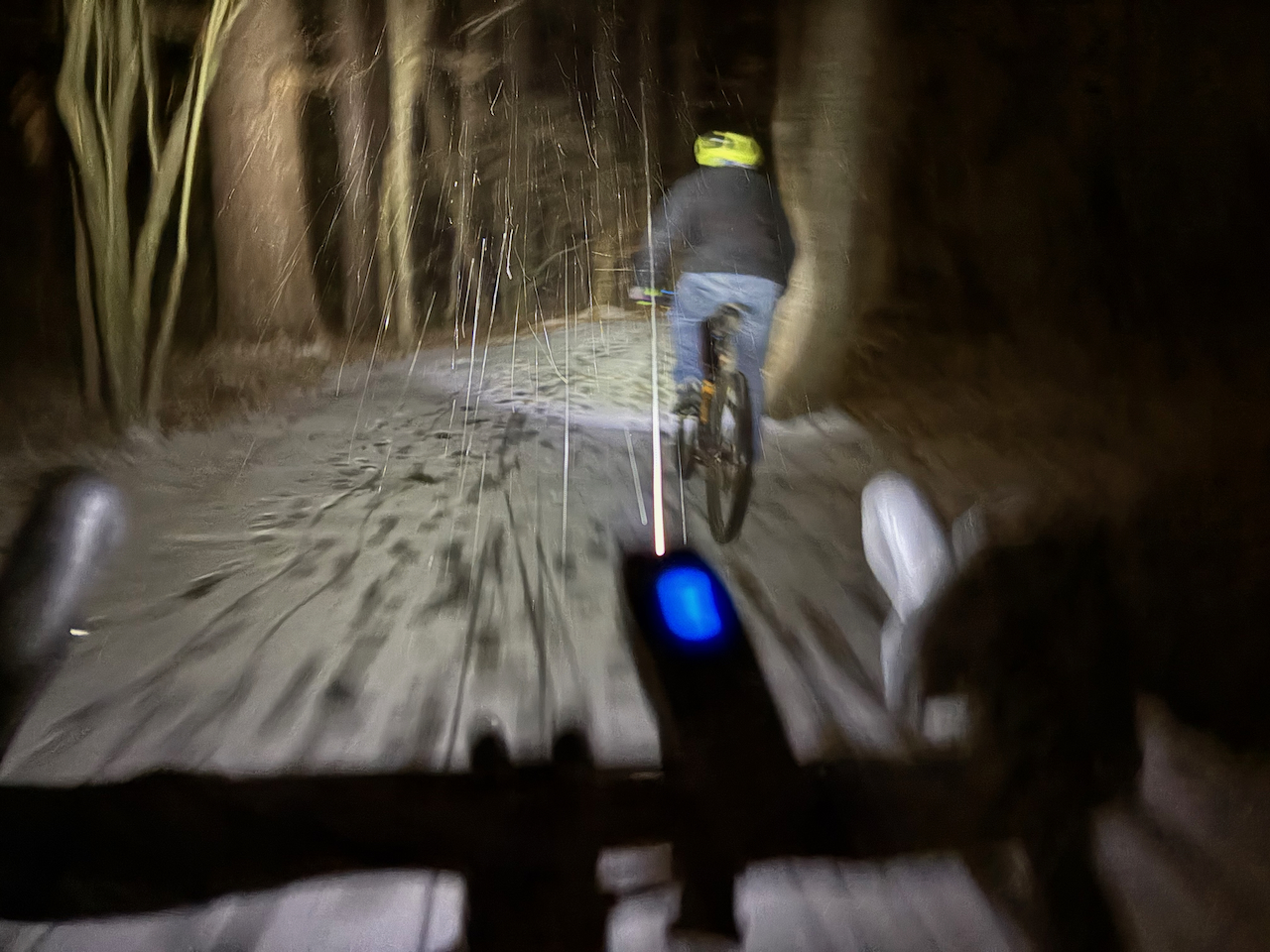
Riding Junebug one-handed in the snow on Specialized Renegades
The frame and fork
The Lynskey Ridgeline is pretty firmly in the early 29er hardtail category with a relatively steep headtube, short reach, and geometry that was probably more of a response to 26″ hardtails than anything else. Despite the conservative (dated) geometry, the chainstays are mercifully short and the result is reasonably balanced: not too twitchy and it definitely does not feel sluggish. This Ridgeline is also built around a 100mm fork, which resulted in an annoyingly tall stack for a hardtail, but when combined with the short reach it makes a pretty nice platform to attach a dropbar. I believe the combination of these traits make the Ridgeline an excellent option for a dropbar conversion and, depending on component choices, could result in a more capable and versatile dropbar MTB than the Eriksen.
Wheel size
The Lynskey was and still is a 29er. Aside from the widely discussed benefits of a larger rolling diameter, what is the single largest benefit of a 29er over 650b? Tyres. There are significantly more tyre options in 700c/29″ than 650b/27/5″. There are more tread options, more casing options, more widths, and more everything. There are especially more high-end 29″ XC tyres, which are what I want on my dropbar MTBs.
Junebug currently has a pair of Specialized Renegade S-Works 29×2.1″ tyres, which weren’t ideal in the snow (see above), but have been quite capable and quick everywhere else I’ve ridden them. I don’t really know what to expect for durability and longevity, but I imagine I’ll find out.
Drivetrain and brakes
Eric used Ultegra RS685 11-speed levers and BR-RS785 post-mount calipers for the initial conversion, and I’ve left them in place. The levers look and feel like Ultegra, and the calipers seem to fall in a similar position in the Shimano lineup. Like most things Shimano these work well and are pretty reliable. No boutique parts needed here, just Shimano 11-speed road parts all working together as intended. The left-side lever does still have its unused 2x shifter in place, but it’s not causing any trouble. I could have used it as a dropper lever but I’d rather not permanently disable the shifter in the process. More on droppers later.
Eric rode in a less hilly part of the world and subsequently had a smaller 11-36t cassette and a quite interesting Ultegra RX clutched rear derailleur. The Ultegra RX is the proto-GRX 1x rear derailleur that is quite similar to GRX 11-speed, aside from its 34t max cog capacity. I made the pretty simple swap to a GRX 812 11-speed rear derailleur and an 11-42t cassette, which allowed me to keep the RS685 levers and brake, but gain a lot of low-end gearing for the local Melbourne terrain (the Ultegra RX derailleur has found it’s way on to the 2×11 Lynskey R300 road-ish bike).
The result of the conventional Shimano 11-speed drivetrain is that the bike feels a lot more like a road bike than the Eriksen, something which is further reinforced with the handlebar selection.
Handlebars and stems
Eric had a Ritchey WCS Butano 42cm (73mm reach / 118mm drop / 12° flare) on the bike, which worked reasonably well, but I do not like traditional dropbars with little-to-no flare offroad. I find the curved ends of the bar tops often hit my wrists and forearms when riding in the drops on wide(ish) dropbars offroad, and these Ritchey bars fell into that category. Fortunately for me, I still had those Salsa Cowchipper 44cm (68mm reach / 116mm drop / 24° flare) from the Eriksen. Aside from the flare, the drop and reach are reasonably close to the Butano. Overall, the Salsa’s feel a lot more road-like than the Ritchey Beacon bars on the Eriksen, and seem to be a reasonable compromise for something that will see more gravel and path use. (Very brief aside: I have a narrower 40cm Ritchey WCS Butano Internal on the more road-oriented Lynskey R300, and it’s fantastic.)
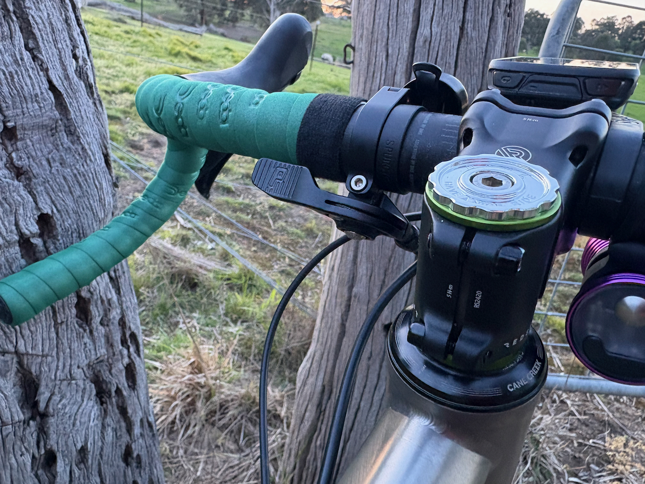
The Redshift 55mm / 6° rise suspension stem is a bit of a curiosity, but I think it works. I’m not sure I’d miss it if I swapped for a traditional/rigid stem, but I appreciate the compliance and comfort. The slight rotation of the bars was a little disconcerting initially, but you quickly get used to it and it’s not an issue.
There’s a bit going one here
Seatposts
One potential issue with using a MTB frame as a dropbar bike are the drastically sloping top tubes that can result in excessive seatpost length. This isn’t generally an issue, and can be an advantage in some situations, as long as those situations include a 30.9 or 31.6mm seatpost. On Junebug my saddle height resulted in a 295mm collar-to-saddle-rail extension. This wasn’t an issue with the 400mm Lynskey titanium post, but is still longer than the spec on the longest 27.2mm external-cable dropper I could find. I really wanted to use a PNW Coast gravel 100mm suspension dropper (yes, gravel suspension dropper seat posts exist, and I have one of these on my rigid 29er singlepspeed), but the excessive seatpost extension here ruled it out. The PNW Pine 110mm dropper post was the best match to my requirements and is a close enough, but even it is running a bit above its minimum recommended insertion with my current saddle and crank length selection.
I used a Paul’s Component Engineering 31.8 Dropper Trigger mounted near the stem along with my own design 3D-printed brake hose shift cable clips to run the cable back along the top tube to the post. I’ve had a lot of parts from Paul’s over the decades, they’ve all been pretty fantastic and this one is no exception. The cable routing on the Paul’s lever nicely accommodates the stem, the lever position is nice and it looks great. Downsides? While the lever still less expensive (only if you don’t opt for the polished version) than the dropper, it’s not by much. I would have opted for a nice, bright colour, but when I ordered this I still hadn’t decided which dropbar bike was going to get the dropper, so it’s black. As far as actual use goes, it works well if you’re on the bar tops, but I prefer to descend in the drops so it’s not always ideal. The work-around? Just plan ahead a little.
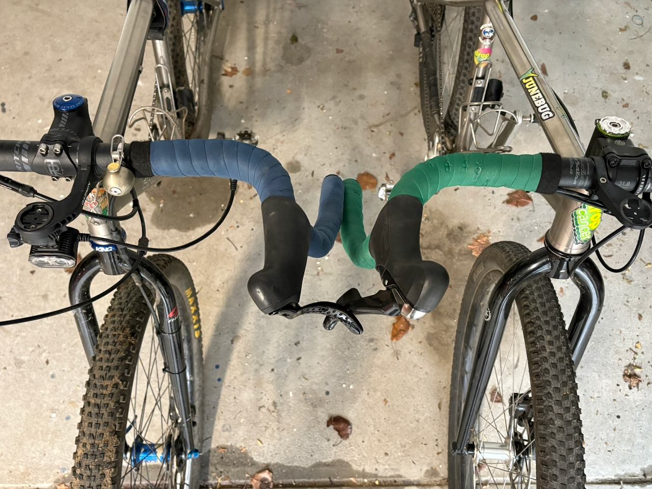
The Eriksen and Junebug. Maybe someday I’ll share the story behind Junebug’s headbadge.
I prefer the widely flared bars, the feel of the TRP Hylex brakes, and the quirkiness of the Gevenalle shifters on the Eriksen.
How do these bikes compare?
There’s not a lot between the geometry of the two as they’re both based around early XC bikes, but the slightly taller front end on the Ridgeline is better suited to dropbars. Big wheels feel great on gravel and singletrack, and I don’t see any downside; I would choose 29″ wheels over 650b any day. The drivetrain and bar choice are more road/gravel-oriented on Junebug, but I think I prefer the widely flared bars, the feel of the TRP Hylex brakes, and the quirkiness of the Gevenalle shifters on the Eriksen.
Droppers are fantastic. The Erisken would absolutely benefit from a dropper, and a PNW Coast would be ideal. However, I’m far too happy with how the Kent Eriksen titanium Sweetpost looks and feels (mostly looks) to ever swap it out. I took Junebug down a short black DH and it was actually more fun than I anticipated. The track is apparently named Down you go and is basically a fall line on the cliff/hillside on the Plenty River north of Whatmough Park near Greensborough (no gaps, just steep, rutted, and loose). With a dropper post it felt more like under-biked XC riding technical downhills than anything else.
There’s clearly a lot of overlap between these two bikes, not necessarily much to distinguish them, and I’ll probably have a difficult time choosing which to ride. I may try slightly more aggressive tyres on the Eriksen someday, perhaps something better suited for winter riding.
Whatever the case, I hope some of these slightly different solutions to similar dropbar conversion problems on these two examples might be useful to anyone considering their own dropbar MTB conversion.
If 29″ is better than 650b/27.5″, then why not 32″?
What about a 32″ dropbar MTB?
If 29″ is better than 650b/27.5″, then why not 32″? That’s not a bad idea. It would be like the Eriksen or the Ridgeline, but with the toe overlap of the Gunnar and even more expensive tyres. But wait, what about 750D/30.5″? 🙄
During the course of writing about Dropbar MTBs GCN released the Is A Gravel Bike Still Just A Dated Mountain Bike? video. I thought about using it as a literature review to extend my joke of formatting this post as an academic paper, but that seemed a bit much. Instead, here are my (brief) thoughts about the video.
Between product shots of their sponsor’s (Canyon) gravel bike, they do discuss the use cases for the two types of bikes, point out some of the advantages of each bike, the poor suspension performance, and recognise the importance of anodised aluminium and other aesthetic qualities of the bikes. This all sounds familiar. They also tested both bikes on a range of terrain from sealed roads, gravel, to singletrack. Also familiar and reasonable.
…this 2026 Canyon gravel bike owes quite a large debt to the splatter-painted GTs (an other MTBs) from the 1990s.
However, what they absolutely overlooked was that the splatter-paint on this 2026 Canyon gravel bike owes quite a large debt to the splatter-painted GTs (an other MTBs) from the 1990s. This seems like a pretty glaring oversight and would have fit better in the video than the meaningless 7w of aero drag improvement in a wind tunnel at freeway speeds.
Unsurprisingly, they found a lot of nice things to say about their sponsor’s bike and had more than a few (generally justified) criticisms for the “old man bike”, a 1994 GT Zasker LE. In the end, they determined that gravel bikes and ‘dated mountain bikes’ shared little in common and the Canyon is great. None of this is surprising as the question asked in this video is clearly just a vehicle to advertise the Canyon, and it’s not bad when viewed from this perspective.
Does the video answer the question or add much to this discussion? Not really. But, I will suggest here and as I did earlier, the answer to their question is probably “dropbar MTB” (edit: and a second dropbar MTB for good measure).