
This is part of my Home Decarbonisation Project and is going to be another one of those article response posts, but this time I’ll be brief.
What did you read this time? In an ABC article Watchdog circles WA utility as ‘unusual’ battery charging pushes prices higher they share a plot showing us how the grid-scale batteries in WA have flattened the electricity prices between Q4 2024 and Q4 2025. This is pretty straightforward and a good example of one of the primary benefits of the load shifting batteries enable, and even better that it’s clearly communicated in the plot below.
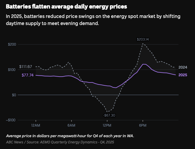
A little explanation, please? Those who have looked at a time of use (ToU) energy plan might see some correlation between the 2024 daily average price (and to a lesser degree the 2025 data) and the pricing offered to you by your retailer. If you want more, I go into a lot more detail in my previous post, Time of Use Energy Plans, otherwise below is my very brief visual explainer for daily electricity pricing in Australia.
ToU pricing and electricity demand in Australia
A time-of-use tariff against the shape of a typical demand day
Hover to show time of day and click a series in legend to show/hide.
Show source data
| Tariff | Time of Day | Cost (AUD) |
|---|---|---|
| Daily Charge | 1.133 / day | |
| Solar Soak | 11:00 – 16:00 | 0.1815 / kWh |
| Offpeak | 21:00 – 11:00 | 0.22330 / kWh |
| Peak | 16:00 – 21:00 | 0.40700 / kWh |
Usage and daily supply rates include GST. Rates shown are before any conditional discount.
Indicative demand is not measured system demand. It is the shape of the VIC wholesale spot price for Q4 2024, the year before grid-scale batteries flattened it (see the companion cost-comparison chart), normalised to its own range: 0% at the day’s lowest 5-min average, 100% at its highest. Wholesale price and demand are not equivalent; price also reflects supply-side conditions (eg. rooftop solar), which is why prices can go negative when demand still exists. But I’d argue they’re similar enough for the shape of this curve to stand in for a typical demand day. What do you think?
Sources. Wholesale prices: AEMO, Quarterly Energy Dynamics — Q4 2024 , Figure 14 “Average regional energy price by time of day,” Victoria series, read from the report’s own chart data (published January 2025). Rates: GloBird Energy Boost from 1 August 2026, at crossgeared.com/time-of-use-energy-plans.
Solar is modelled using clear-sky global horizontal irradiance computed from solar geometry for Melbourne, Australia (37.81°S, 144.96°E) on the 15th of each month, averaged hourly and scaled. Times displayed are local Melbourne time, and the change from AEST to AEDT shifts the relative curve location. This solar visualisation represents sunlight falling on a horizontal surface and is not directly corerlated to the output of rooftop solar, but I think it’s a pretty good visual indicator of how much output you might expect from your system.
And, this is relevant how? Finally, here's a direct comparison with my (very limited) before and after late winter battery forced loading showing my ToU cost per kWh compared to my effective cost per kWh making some assumptions about losses and system efficiency using actual data. However, these data are so limited that it probably better described as an anecdote. Also note that the scales for these plots are completely different as my costs are retail in cents per kWh and the WA wholesale spot price is in AUD per MWh (1 AUD = 100 cents and 1MWh = 1,000kWh).
What Batteries Have Done in WA and What They're Doing for Me
Grid batteries flattened WA wholesale prices as well as my electricity costs at home
Hover either panel to show hourly data. Click a series to show/hide.
WA Wholesale Spot Price
Average half-hourly price, Q4 2024 against Q4 2025.
ToU Tariff and Effective Cost
Battery forced loading, 7–23 August 2026.
Show source data
| Series | Mean | Minimum | Maximum | Peak-to-trough |
|---|---|---|---|---|
| Q4 2024 | 79.93 | −67.30 at 12:00 | 203.14 at 18:00 | 270.44 |
| Q4 2025 | 69.55 | 28.40 at 13:30 | 121.49 at 18:00 | 93.09 |
| Tariff | Time of Day | Cost (AUD) |
|---|---|---|
| Daily Charge | 1.133 / day | |
| Solar Soak | 11:00 – 16:00 | 0.1815 / kWh |
| Offpeak | 21:00 – 11:00 | 0.22330 / kWh |
| Peak | 16:00 – 21:00 | 0.40700 / kWh |
Data used to for my effective cost was measured for 17 days from 7 to 23 August 2026. Battery forced loading occurred during solar soak period (11:00 - 16:00) with an estimated round-trip efficiency of 85-90%; plotted as 20.625c at 88%, shaded band 21.353c at 85% to 20.167c at 90%. More on forced loading: Battery Management.
The two panels are scaled so the WA Q4 2025 mean and my effective mean align. The alignment is for comparison of the shapes of the curves as the scales are completely different, both figuratively and literally.
WA Wholesale price data: ABC News, Batteries flatten average daily energy prices,
Datawrapper chart fH1Uf, 20 August 2026, from AEMO Quarterly Energy Dynamics
— Q4 2025; dataset retrieved from
datawrapper.dwcdn.net/fH1Uf/2/dataset.csv on 2 September 2026.
“Watchdog circles WA utility as ‘unusual’ battery charging pushes
prices higher”, ABC News, 2 September 2026. My data: half-hourly interval
metering, sourced from GloBird Energy, 23 January to 2 September 2026, timestamps AEST.
Rates: GloBird Boost from 1 August 2026, at
crossgeared.com/time-of-use-energy-plans.
Hardware: Fronius Primo GEN24 5.0 Plus with a 19.3kWh BYD HVM battery, forced loading at a
minimum of 2kW between 11:00 and 16:00, at
crossgeared.com/battery-management.
What does this tell us? Much like the batteries in WA, my home battery is flattening the daily cost of electricity to the point where peak pricing has essentially been completely offset with lower-priced electricity from the solar soak period. It's not the relative costs per kW or MW hour that are important (well, they are when you get your bill, but not for my purposes here), but rather the shape of the curve, specifically the flat effective cost during evening peak pricing. Extrapolate that out over a winter and the costs add up. I can see two equally true interpretations of these data.
A properly managed solar and home battery system can eliminate peak pricing, even in the winter!
- Your local solar installer
Home battery offers no benefit for nineteen hours every day.
- Large news source that controls half the newspapers
Whichever way you look at it, the automated management I've set up for my particular home and solar/battery system means we can be more flexible when we use electricity with less consideration given to the prices set by our retailer. Meaning we can run the heat, oven, dishwasher, or whatever* whenever needed. Furthermore, we can use electricity in the evening peak without contributing to overall demand, curtailing the peak, and contributing just a little to reducing the demand for fossil fuelled energy.
*- Big caveat here, maybe not charging the EVs as they have a battery capacity 2-3x the home battery. Maybe I should write about that?
References and resources
- Watchdog circles WA utility as 'unusual' battery charging pushes prices higher (https://www.abc.net.au/news/2026-09-02/wa-energy-watchdog-probes-battery-charging-price-rise/107104282)
- AEMO Quarterly Energy Dynamics — Q4 2024, Figure 14 "Average regional energy price by time of day," Victoria series, read from the report's own chart data (published January 2025). (aemo.com.au/-/media/files/major-publications/qed/2024/qed-q4-2024.pdf)
Leave a Reply